


Identyfikacja wizualna, która działa


Alicja Kobza jest laureatką konkursu na identyfikację wizualną Warszawskiego Obserwatorium Kultury, ogłoszonego zaraz po tym, jak WOK został powołany do życia. Moment był o tyle nietypowy, że instytucja dopiero zaczynała tworzyć program i określać swoją tożsamość. Ważne było jednak dla nas, by podkreślić naszą rolę jako instytucji wypracowującej prototypowe rozwiązania i dobre praktyki, świadomość ekologiczną w obszarze projektowania graficznego oraz ożywcze podejście do tematu. Ponieważ jesteśmy nową instytucją, chcemy rzeczy robić dobrze od początku.
Komisja ekspertów
Przeprowadziłyśmy research w temacie konkursów na identyfikację wizualną, zarówno w instytucjach publicznych, jak i w biznesie. Zapytałyśmy grafików i graficzki oraz przedstawicieli i przedstawicielki różnych organizacji o ich doświadczenia. Do komisji konkursowej zaprosiłyśmy profesjonalistów, dbając o różnorodność punktów widzenia: prof. Artura i Magdalenę Frankowskich, Pawła Janickiego, dr Katarzynę Kasię, Lenę Pianovską. Zespół WOK reprezentowała Agnieszka Tiutiunik.

Fot. Monika Stolarska
Jak wybierałyśmy
Zdecydowałyśmy się na formułę konkursu zamkniętego, posiłkując się eksperckim głosem członków i członkiń komisji oraz ich znajomością środowiska projektantek i projektantów graficznych. Zmapowałyśmy osoby i studia, których praca, w ocenie komisji, wnosi świeżość do projektowania graficznego. Ważne było dla nas również, by osobom biorącym udział w konkursie zaproponować wynagrodzenie za przygotowanie projektu i podpisać z nimi umowy zanim przystąpią do pracy.
Projekt graficzny: Alicja Kobza
Po serii inspirujących rozmów z listy 22 osób i podmiotów komisja wytypowała 5, które zaprosiłyśmy do wzięcia udziału w konkursie. Byli i były to:
- Alicja Kobza,
- Fajne Chłopaki,
- Studio Lekko,
- Madina Mahomedova,
- Martyna Wędzicka.
Poprosiłyśmy o przygotowanie propozycji znaku słowno-graficznego identyfikującego Warszawskie Obserwatorium Kultury oraz przykładów jego wdrożenia na trzech elementach: papierze firmowym, wizytówce elektronicznej i layoucie strony www. Oprócz oceny pod względem zgodności z celami i przeznaczeniem, jakości i atrakcyjności koncepcji, oryginalności, innowacyjność i ekologiczności, czytelności i wiarygodności przekazu i wykonalności, projekty zostały też poddane recenzji pod kątem dostępności. Komisja konkursowa przygotowała następnie uzasadnienie swojego wyboru oraz informację zwrotną dla wszystkich, którzy i które wzięli i wzięły udział w konkursie, co wraz z ekspertyzą dostępności zostało przesłane do uczestników i uczestniczek.
Z nadesłanych propozycji komisja konkursowa wybrała dwa projekty: Alicji Kobzy oraz Martyny Wędzickiej. Obie propozycje, choć bardzo różniące się koncepcyjnie, uznano za równie dobre. Podążając za rekomendacjami naszych ekspertów i ekspertek z komisji, zdecydowałyśmy się na zaproszenie obu autorek do „dogrywki”, czyli do rozmowy o potrzebach instytucji, która dała im możliwość lepszego zrozumienia specyfiki naszej działalności, oraz do przygotowania projektu szablonu do prezentacji danych, na podstawie którego została podjęta ostateczna decyzja o dalszej współpracy. Uczestniczki konkursu miały też możliwość wprowadzenia modyfikacji do poprzednio zaproponowanej wersji logotypu.

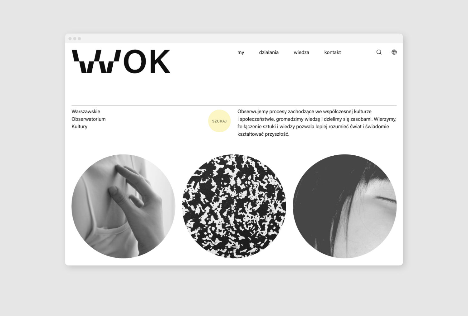
Projekt strony WOK: Alicja Kobza
Co zdecydowało o ostatecznym wyborze
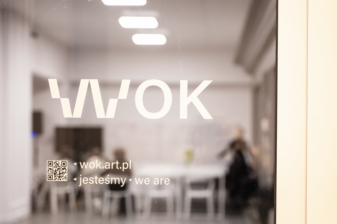
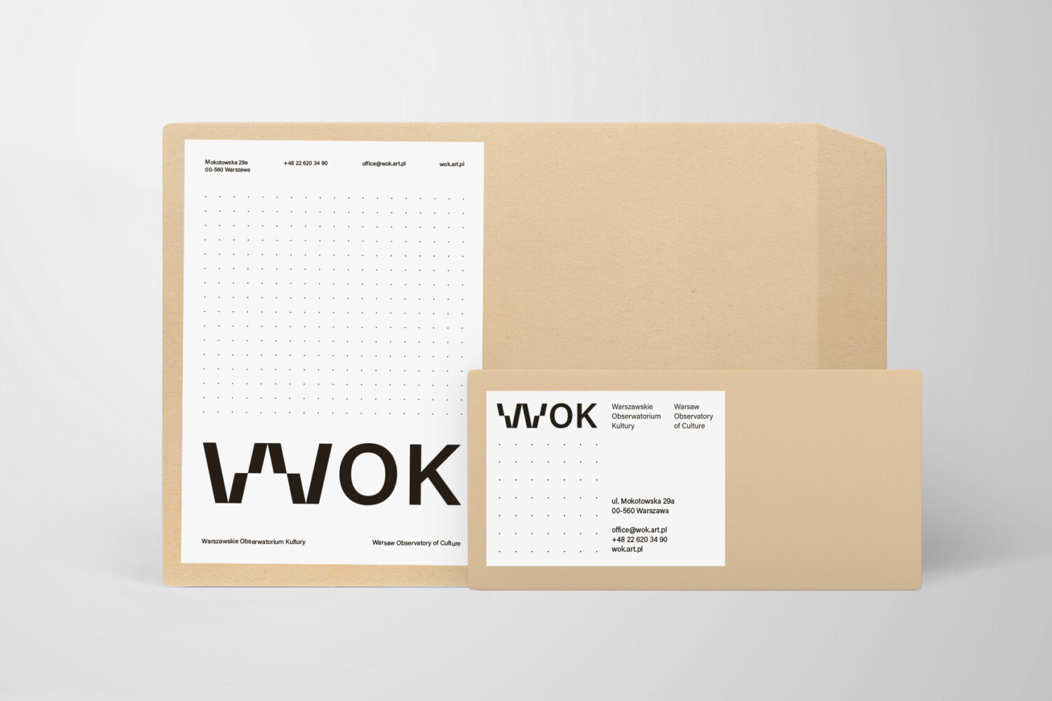
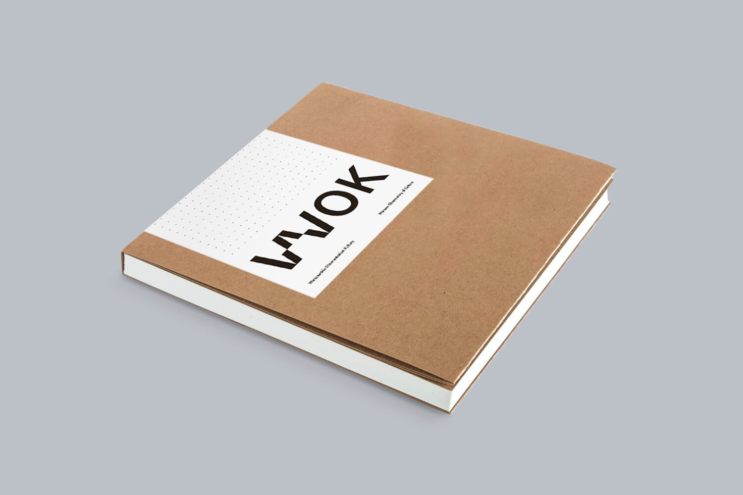
Alicja Kobza zaproponowała znak dynamiczny i otwarty, z którym można z powodzeniem pracować dalej, rozszerzając identyfikację wizualną o kolejne elementy. Pomimo zmienności znak jest bardzo wyrazisty i czytelny – w każdej z modyfikacji widać, że należy ona do tej samej identyfikacji wizualnej i konkretnej instytucji. Wariantowość znaku wpisuje się w złożony charakter planowanych działań WOK. Ponadto zmienna typografia zastosowana już w samym logotypie jest znakiem czasu i wyznacznikiem nowoczesności w projektowaniu. Wszyscy członkowie i członkinie komisji byli i były zgodni co do tego, że przyszłość będzie należeć do marek dynamicznych i identyfikacji wykorzystujących zmiennych fontów.
Komisja konkursowa doceniła również sposób, w jaki autorka przeanalizowała brief konkursowy i w systemie identyfikacji zawarła otwartość i dynamiczność WOK. Alicja Kobza zaproponowała gotowy system, z którego z łatwością można wyprowadzić kolejne motywy graficzne o wspólnym DNA, układające się w spójne sekwencje. Ponadto wyraźny jest kontekst, w którym znak jest umieszczany i z którego się wywodzi, oraz język, jakim instytucja się komunikuje – zastosowany język wizualny przynależy do szeroko pojętej kultury i świata artystycznego. Wariantywny znak daje się też łatwo przełożyć na dźwięk – można wyobrazić sobie sygnaturę dźwiękową, która mu odpowiada, a to daje olbrzymi potencjał budowania dostępności. Te wszystkie cechy i niesamowita intuicja autorki co do specyfiki pracy WOK, a także jej zmysł estetyczny, ułatwiły wybór. Alicja Kobza została zwyciężczynią konkursu na identyfikację wizualną Warszawskiego Obserwatorium Kultury.

Autorce powierzyłyśmy przygotowanie pełnej księgi znaku oraz zaprosiłyśmy ją nie tylko do współpracy przy wdrażaniu identyfikacji, ale również do rozmów o celach i wartościach naszej organizacji. Chciałyśmy, by Alicja od początku czuła się częścią zespołu i współtworzyła Warszawskie Obserwatorium Kultury. Wspólnie z Alicją do dziś pracujemy nad kolejnymi elementami identyfikacji WOK, dbając o naszą codzienną współpracę. O tym też jest rozmowa „W witrynie WOK”.
Spotkałyśmy się w WOK Labie – graficzka Alicja Kobza i strateżka komunikacji Agnieszka Tiutiunik – i porozmawiałyśmy o naszych doświadczeniach. Czym kierować się, przygotowując identyfikację wizualną? Jak wygląda proces? Co robić, a czego nie robić, żeby współpraca była udana?
