Visual identification that works
Alicja Kobza was the winner of our contest for the visual identity of the Warsaw Observatory of Culture, announced shortly after WOK was founded. The timing was unusual in that the institution was just beginning to develop its programme and define its identity. However, it was important for us to emphasise our role as an institution that develops prototypical solutions and best practices, advocates environmental awareness in the field of graphic design, and takes a fresh approach to the subject. As a new institution, we wanted to get things right from the start.
A committee of experts
We researched visual identification design contests organised by both public and corporate entities. We asked graphic designers and representatives of different organisations about their experiences with contests. We also invited experts to sit on our Committee and made sure they represented different perspectives. Our jury consisted of: Professor Artur Frankowski, Magdalena Frankowska, Paweł Janicki, Dr Katarzyna Kasia, Lena Pianovska and Agnieszka Tiutiunik on behalf of WOK.
How was the selection made
We decided to hold a closed contest, guided by the expert advice of the Committee members and their knowledge of the graphic design community. We were looking for individual designers and design studios whose work demonstrated a fresh approach to graphic design. We also felt it was important for entrants to provide a quote for their contest design and to sign contracts with them before they started their design work.
After a series of inspiring interviews, the Committee shortlisted 5 of the 22 entrants and invited them to submit their work to the contest. The shortlisted entrants were:
- Alicja Kobza
- Fajne Chłopaki
- Studio Lekko
- Madina Mahomedova
- Martyna Wędzicka.
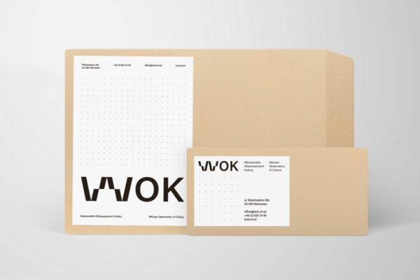
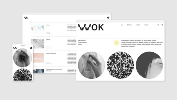
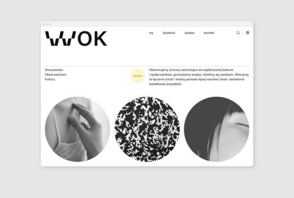
We asked the participants to develop a proposal for a wordmark logo identifying the Warsaw Observatory of Culture and some examples of its implementation on three different media: letterhead, electronic business card and website layout. In addition to price, we took into consideration consistency with the purpose and intended use, quality and attractiveness of the concept, originality, innovation and sustainability, legibility and credibility of the message, and feasibility, the contest designs were evaluated in terms of accessibility. The Contest Committee then drew up the reasons for their choice and gave feedback to all participants in the contest, which was sent to them along with an accessibility study.
Of all the submissions, the Contest Committee selected two proposals, the works of Alicja Kobza and Martyna Wędzicka. Both proposals, although conceptually very different, were found to be equally good. Following the recommendations of our experts on the Committee, we decided to invite the two designers to a ‘design-off’, i.e., a discussion about the needs of the institution, which allowed them to better understand the specific nature of our activities and the task of developing a draft template for data presentation, which would then serve as the basis for the final selection. Participants also had the opportunity to make adjustments to the design versions submitted.
How the final decision was made
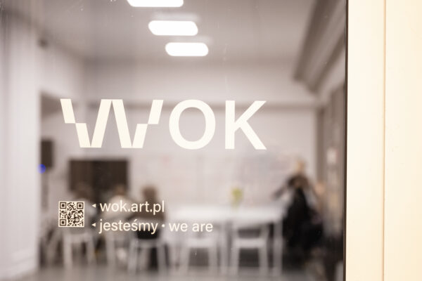
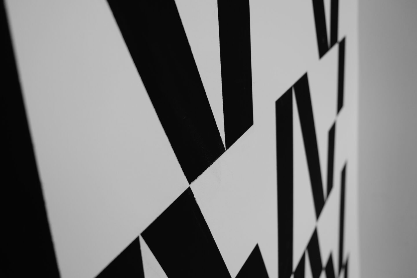
Alicja Kobza proposed a dynamic and open logotype that can be adapted to different uses and expanded with new visual elements. Despite its changing nature, the logotype is very clear and legible; in each version, it is clear that the logotype is part of the same visual identification and represents a specific institution. The variable nature of the logo fits well with the complexity of WOK’s planned activities. Furthermore, the variable typography used in the logo itself is a sign of the times and an indicator of modernity in design. All Committee members agreed that the future belongs to dynamic brands and identities using variable fonts.
The Contest Committee also appreciated how the designer analysed the contest brief and incorporated WOK’s dynamism and openness into the visual identity system. Alicja Kobza has designed a ready system that can be easily extended with new graphic elements with a common DNA that can be used in consistent sequences. Moreover, the context in which the logo is placed and from which it derives is clear, as is the language with which the institution communicates; the visual language used belongs to the broader cultural and artistic world. The variant-based logo can easily be adapted to sound, it is easy to imagine a corresponding signature sound, which has enormous potential in terms of accessibility. All these qualities, together with the author’s incredible intuition about the specifics of WOK’s activities and her aesthetic sense, made the decision easy. Alicja Kobza was chosen as the winner of the contest for the visual identity of the Warsaw Observatory of Culture.
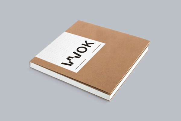
We commissioned the designer to develop a complete brand book and invited her not only to work on the implementation of the identity but also to discuss the goals and values of our organisation. We wanted Alicja to feel part of the team from the very beginning and to co-create the Warsaw Observatory of Culture. Together with Alicja, we are still working on other elements of WOK’s identity to ensure a streamlined day-to-day collaboration. This is also the subject of our conversation In the WOK window.


